A wine label design can tell you
more than you think
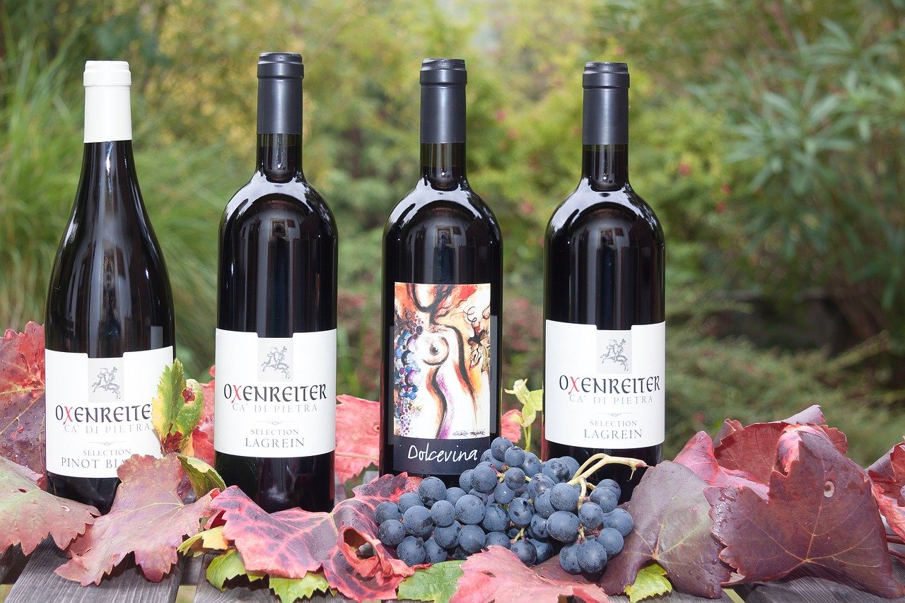
Last week, I opened a bottle with the most intriguing wine label design; it was one of the surprising bottles in my shipment from Naked Wines.
The label was white with a giant fish drawn as if he wanted to escape the bottle. The fish colors were yellow and green, and there was a fishing hook represented on the capsule, which told me the wine would be a perfect match with a fish dinner.
A wine label design can influence your wine tasting experience
I opened the chilled bottle expecting aromas of fresh and juicy fruits.
I was not disappointed by the typical grapefruit and tropical notes of a Sauvignon blanc. The surprise came in the mouth when I perceived toasted oak and citrus fruit at the same time.
It felt like the two aromas were clashing against each other instead of blending in. Oak aromas were the last notes I expected to perceive in this wine, based on what the label communicated to me.
In our science jargon, we would say that there was dissonance between the promise created by the wine label design and the experience.
Have you ever had such an experience?
The three wine label design elements that could influence the aromas you smell
It’s not the first time I write about the impact a wine label design can have on your sensory experience. Colors, shapes, and names can evoke particular sensations, just by seeing or reading them on a bottle of wine.
1- Label Color
In this article, “How to Choose Wine That Tastes Good?” , I shared a study looking at aroma associations with specific label colors.
We learned that:
- A red label matched with Tanguy, Fruity, and Floral aromas. Other research had shown that the color Red evoked intense aromas and also tended to make people feel more exciting in contrast with more calming blues.
- A black label matched with Dry, Woody, and Earthy aromas.
- To convey luxury or elegance, marketers often choose the color, Black.
- The orange label evoked Fruity and Flowery aromas, along with a sweet taste.
2- Label Shape
Colors and also shapes on a wine label design can evoke specific sensations.
Researchers from the University of Tennessee asked participants to associate five Chardonnay wine aromas (Buttery, Citrus, Floral, Smoky, and Vegetable) with different shapes varying in roundness, angularity, and colors (Red, Brown, Yellow, and Green).
They found that the vegetable-forward Chardonnay wine matched better with sharper shapes. However, associations between colors and aromas were not strong enough to conclude.

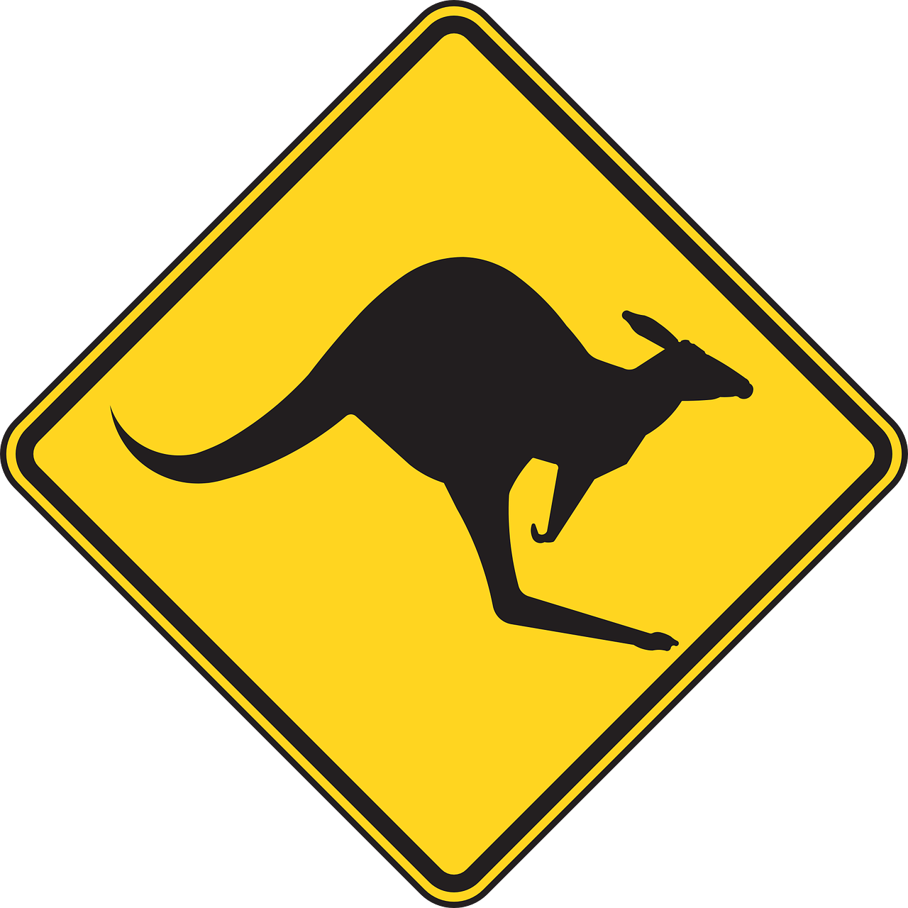
The use of familiar images, such as a kangaroo or a fish, helps people remember the wines when shopping; it’s more useful for some than trying to memorize the brand or the producer name.
However, I haven’t found studies evaluating the power of associations between wine label images and aromas.
3- Label brand
Some varietal wines have names difficult to pronounce, such as Gewurtztraminer or Agiorgitiko. Studies indicated that these names might evoke complex wine aromatic profiles.
Canadian researchers showed that when a winery name was hard to pronounce, knowledgeable wine tasters tended to like the wine better than the same wine without this label.

Other indicators that may lead you to think of superior quality
English researchers demonstrated that we wine consumers are ready to pay more for a heavy bottle of wine, associating bottle weight with excellent quality.
The sound of the cork popping out of the bottle can also make you think the wine will be superior. The study compared people tasting a wine closed by a traditional cork (and hearing the sound) and tasting a wine closed by a crew cap.
Advocating for blind wine tasting
So many factors can influence how we experience wine during a tasting: from the wine label design, the bottle shape, color, weight, closure, the label information, to the tasting environment.
“Drinking wine engages more of our brain than any other human behavior”
G. Shepherd cited by C. Spence.
It’s challenging to run a proper blind tasting, without any information, without seeing the bottles or the tasting sheet. However, blind tasting is the only way you can assess the aromatic and taste qualities objectively. Removing biases is particularly important when you study wines towards a certification.

New! Comments
Have your say about what you just read! Leave me a comment in the box below.References
Spence C. Cognitive Research: Principles and Implications (2020) 5:22
Mantonakis, A. , Galiffi, B. , Aysan, U. & Beckett, R. (2013). The Effects of the Metacognitive Cue of Fluency on Evaluations about Taste Perception. Psychology, 4, 318-324. doi: 10.4236/psych.2013.43A046.
Heatherly, M., Dein, M., Munafo, J. P., & Luckett, C. R. (2019). Crossmodal correspondence between color, shapes, and wine odors. Food Quality & Preference, 71, 395–405.


Published September 16, 2020